• Bio
    • Awards
    • Exhibitions
    • Press
  • Contact
    • Studio & Plein Air Paintings
    • Collections
    • Walt Disney World Projects
  • Videos for Purchase
    • Workshop Videos for Purchase
    • Interviews
    • What People Are Saying...
    • Workshop Video Downloads
  • Events
  • Blog
Menu

Kim Minichiello

Street Address
City, State, Zip
407-668-7082
Artist ⦁ Designer ⦁ Traveler ⦁ Mentor

Your Custom Text Here

Kim Minichiello

  • About
    • Bio
    • Awards
    • Exhibitions
    • Press
  • Contact
  • Artwork
    • Studio & Plein Air Paintings
    • Collections
    • Walt Disney World Projects
  • Videos for Purchase
  • Videos
    • Workshop Videos for Purchase
    • Interviews
  • Workshops
    • What People Are Saying...
    • Workshop Video Downloads
  • Events
  • Blog

Change is Good: Arches vs. Fabriano Paper

May 30, 2020 Kim Minichiello
©Kim Minichiello_A Calming Influence_web.jpg

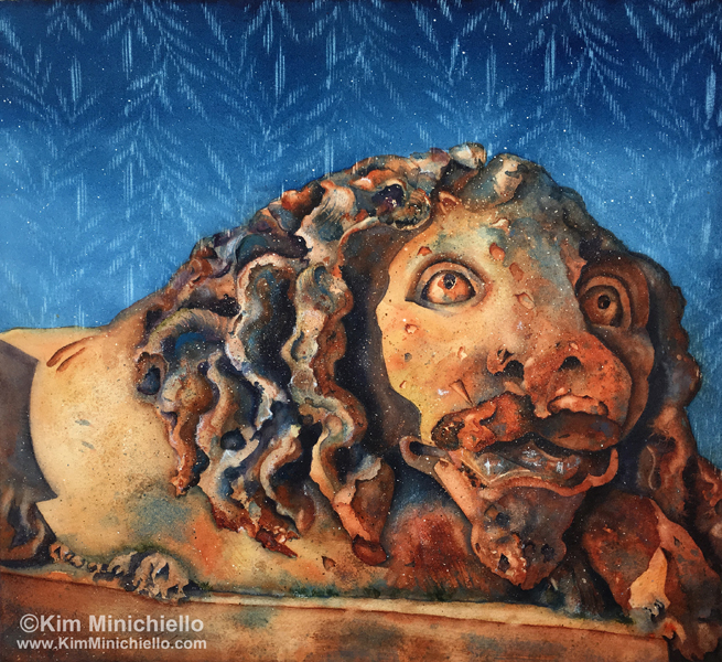
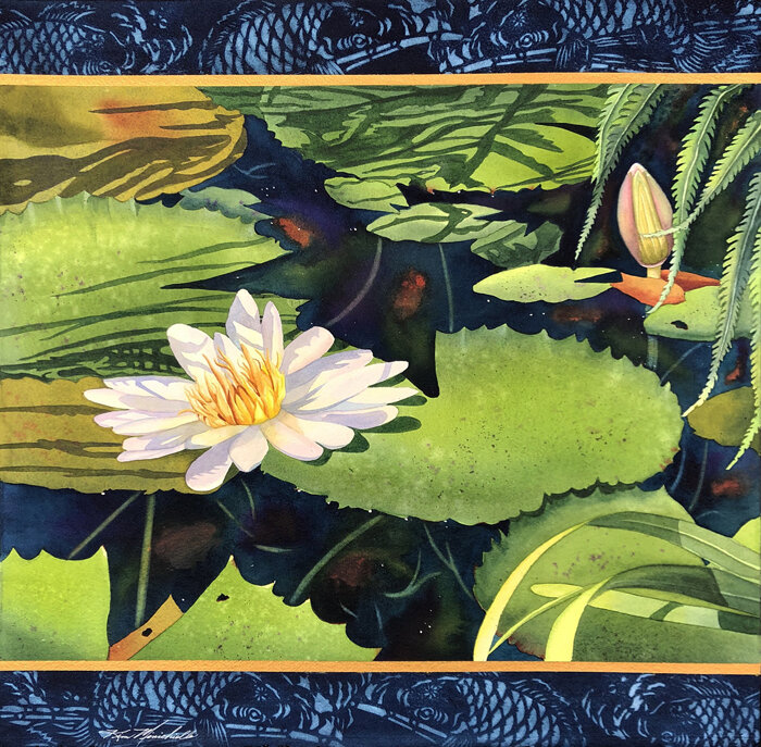
A Calming Influence, 24” x 19,” Watercolor on Fabriano 300 lb. Cold Press

It has been a while since I have written an article on my blog!  Who knew how much the world would change between then and now, and I feel there are more changes to come.  My hope is that the world will be a kinder and more peaceful place.   While I do not like the circumstances and the hardships that many are facing in this wild time, I do believe that sometimes there are good things that come from the bad, and I try to remind myself this to be more at peace.  I’m trying to take more time to do things I enjoy, gardening, cooking, and enjoying nature. This time I’ve had at home during the COVID-19 quarantine  has made me reflect how I may go forward in the future, and I am more grateful for each day I am alive and well.

©Kim Minichiello_In My Solitude_ web.jpg

In My Solitude, 20” x 20,” Watercolor on Arches 300 lb. Cold Press

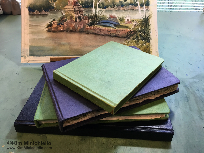
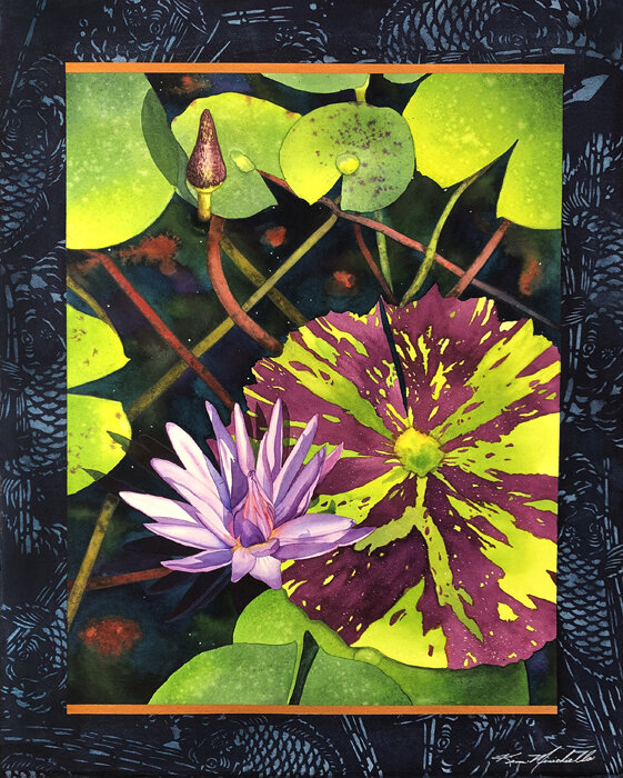
One positive change is having so much dedicated time in the studio!  I have been wanting to do a water lily series on a larger scale. Previously I have only painted them 12” x 12.”   I felt it would be the perfect subject matter to paint during this quarantine time. I find them to be a calming influence. I finally started on them and I am currently working on the fourth in the series.   I have at least five planned. Their titles reflect how I have been feeling during the lock down and how I felt painting them. 

©Kim Minichiello_A Moment of Pause_web.jpg

A Moment of Pause, 22” x 12,” Watercolor on Arches 300 lb. Cold Press

As I mentioned before, painting this subject matter larger is a change.   I spend a  lot of time designing each of my paintings, and love doing it. I make a lot of changes from my original photo references, mixing more than one photo together for the right composition. I  re-work the positions of elements within the photo. I add elements that are needed for the composition, even if they didn’t exist in real life. I also change colors from my photo references, and recently I have enjoyed designing and incorporating borders as part of my body of work.

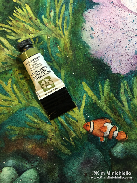
For this series, I ventured out into new paper territory.  Most of my work is on Arches or Twin Rocker paper. ( Never heard of Twinrocker?  You can read it about it here on a previous post. ) The first two in the series were painted on Arches 300 lb. cold press.  On the third painting I decided to try Fabriano 300 lb. cold press.

©Kim Minichiello_Nocturne_web.jpg

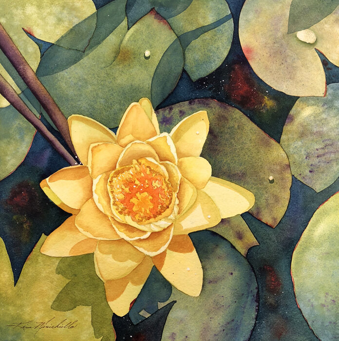
Nocturne, 12” x 12,” Watercolor Mounted on Cradled Archival Board and Sealed


When you have a lot of time invested in designing and drawing it can be a  risk to try something out of the norm.  But if we don’t, how will we learn and grow?  I bit the bullet and committed to completing the painting on the Fabriano paper.  With my particular painting style it took me a while to get used to it until I realized what I normally do had to be done somewhat differently.  As I got into the rhythm of it, I really enjoyed it.  It was like going on a little vacation, which is as good as it’s going to get right now! 

© Kim Minichiello_Interlude_web.jpg

Interlude, 12” x 12,” Watercolor Mounted on Archival Cradled Board and Sealed

What was different, you might ask?  First the paper is softer,  you can tell just by how it feels.  I was worried if I had to scrub out an area or lift, would it mutilate the paper too much, but I didn’t find it to be an issue.  All paper companies have their “secret sauce” for sizing their paper. For example, some use animal byproducts in their sizing, I do know that Fabriano does not.  That is why Arches can sometimes have that wet dog smell.  (No, Arches does not use dog in their sizing, but I think there might be something from an animal in there.)   I feel Fabriano might have less sizing then Arches.  It could have been the weather that day, but I did feel washes tend to dry a bit quicker.  However, working wet into wet, it was fine. Everything stayed wet long enough for me to get done what I needed to in a wash.  I also use masking tape to mask areas I want to preserve the white of the paper and paint later. I was concerned with a softer paper the top surface of the paper would lift off with the tape, but it didn’t, and masking fluid came right off too. 

©Kim Minichiello_Trio web.jpg

Trio, 12” x 12,” Watercolor Mounted on Cradled Archival Board and Sealed

I also felt the color seemed to be more vivid on the Fabriano paper.  The paper could be whiter or the sizing may have an effect on the appearance of the paint on top.  Another factor could be how much paint soaks into the paper versus sitting on top of it.  Whatever it is, I like the results. However, one thing that did take some getting used to was if I  painted over an area twice after the first wash had dried, the paint underneath seemed to lift easier than on Arches.  It took a natural hair brush and a light touch for the first wash not to mix with the second.  That was probably my biggest work around for the way I paint. 

If I were to say anything negative about Fabriano vs. Arches, it would be that their water mark goes all they way across the top of the short side of the paper.  That doesn’t bother some people but if I were to do a painting on a full sheet you would see it as part of my painting.  I’m not so keen on that. One work around is to use the opposite side.  However, there is a different texture on each side of the paper.  If you liked the texture on the water marked side and you wanted to do a painting on a full sheet, you are stuck with it.  Arches’ watermark is more subtle.  It is small and in a corner. 

©KimMInichiello_Meditation II_WEB.jpg

Meditation II, 12” x 12,” Watercolor Mounted on Archival Cradled Board and Sealed

Overall, I felt like the change was good! Would I use Fabriano again?  Absolutely!  Would I stop using Arches, not necessarily.  I tend to use the paper I need for what I want to achieve in the painting because they all behave differently, just like our dear children or pets.  That is why I also use Twinrocker paper and occasionally, when I have the opportunity, I buy other brands I would like to try too.  I have tried some that will never make it into my repertoire, and like Fabriano some brands will have a place in my studio and potentially be used en plein air paintings as well!  

Don’t be afraid of change.  We certainly can’t have that attitude in this unprecedented time in human history.  Take a risk, what are you going to do different today?  Feel free to leave a comment.  If you subscribe to my blog and are getting this via email, click on it to go to my web site and leave your comment there.  :-)

Wishing you continued safety and good health!

Kim

Like this post and leave comments below if you have any questions or comments!

Subscribe
Follow My Blog
Shop Giclée Prints
All Paintings
Shop Note Cards
In Watercolor Paintings, Tips for Artists Tags Arches Paper, Fabriano Paper, Arches vs. Fabriano Paper, Water Lilies, Water Lily Paintings, Water Lily Watercolor, Botanical Art, Contemporary Realism, Floral Art
8 Comments

The 2019 Plein Air Convention in San Francisco

May 27, 2019 Kim Minichiello
Eric Rhoads kicking off the Plein Air Convention 2019

Eric Rhoads kicking off the Plein Air Convention 2019

Back in the late 80s and early 90s my husband and I became familiar with plein air painting.  This is due in most part from our love of the artist Kevin Macpherson, who is one of the preeminent artists working in plein air today.  But also to an art magazine we subscribed to at that time, Plein Air Magazine, published by Eric Rhoads at Streamline Publishing.  We enjoyed it for a few years and then one day a different magazine showed up in our mail box with a letter saying due to lack of interest Plein Air Magazine would no longer be published.   Even though we were not actively painting plein air at the time, we were so disappointed.  We found the magazine to be very inspirational! 

The Faculty for PACE 2019

The Faculty for PACE 2019

Fast forward a few years, Eric started publishing the magazine again and it is one of the top selling art magazines in the country.  Plein air is not just a genre of painting anymore it is a movement. Compare the number of plein air artists painting today and the number of plein air events worldwide, to those in the 80s and early 90s and the difference is astronomical.  

Laurie Kersey Demonstration on the Main Stage

Laurie Kersey Demonstration on the Main Stage

My foray into plein air painting started by urban sketching. (That’s a whole other movement worthy of a different article.)  The portability of having a small bag, with a sketchbook, a small watercolor kit, and one brush was all I needed.  The drive to start doing it was our move to Hong Kong back in the mid 2000s.  I wanted to record in sketch form my surroundings, and my travels to document my experiences and the cultures around me. 

My Husband and I painting at the Viansa Winery, photo credit Barbara Tapp

My Husband and I painting at the Viansa Winery, photo credit Barbara Tapp

A few years later, both my husband and I are plein air painters, he primarily in oils and me in watercolor.  We both sketch in watercolor too.  Once the popularity of this plein air thing caught on, Eric Rhoads started organizing Plein Air Conventions.  After years of wanting to, and it not working out for one reason or another, we finally attended one this year in San Francisco.  They are in a different location every year. 

“Fog Rolling In,” Watercolor, 10” x 14,” Painted Plein Air at Crissy Field, finished in the Studio

“Fog Rolling In,” Watercolor, 10” x 14,” Painted Plein Air at Crissy Field, finished in the Studio

Being a board member of the Florida Watercolor Society and organizing the FWS Annual Exhibition, Convention and Trade Show for 600-700 people for a few years, I thought I knew what to expect.  The Plein Air Convention was similar to what we do, but on steroids!  You could go non-stop if you chose to. There were many wonderful and insightful activities to take part in each day.  

Joseph Zbukvic Workshop

Joseph Zbukvic Workshop

My Convention started on Wednesday with a workshop with watercolor artist Joseph Zbukvic.  While we didn’t get to actually paint in the workshop, it was inspiring and informative to watch Joseph explain his techniques and watch him paint.  There were also Basic’s Courses and a workshop offered by oil painter Joseph McGurl prior to the Convention. 

Editor of Plein Air Magazine and Publisher of Plein Air Magazine, Kelly Kane and Eric Rhoads, Presenting Joseph Zbukvic with a Lifetime Achievement Award

Editor of Plein Air Magazine and Publisher of Plein Air Magazine, Kelly Kane and Eric Rhoads, Presenting Joseph Zbukvic with a Lifetime Achievement Award

The Convention officially kicked off Wednesday afternoon, Day 1, with an Opening Ceremony given by Eric Rhoads, the Plein Air Salon winner was announced for the year, Life Time Achievement Awards given, a painting demo and a Cocktail Party capped the evening. 

Eric Rhoads at Home Room, Spinning the Wheel for Prizes and Dressing for the San Francisco Weather

Eric Rhoads at Home Room, Spinning the Wheel for Prizes and Dressing for the San Francisco Weather

Thursday the next full day of the Convention, Day 2, started with Eric’s Art Marketing Boot Camp for the early birds.  They did get the worm.  If you are a professional artist trying to sell or make a living from your work, the three days of this were worth the price of convention.  Everyday after Boot Camp Eric kicks the day off with Home Room. This was brilliant, not only does he give away prizes, including top dollar ones, he informs you of what’s going on that day with pertinent things you need to know.  Then you are off on your own to explore hourly demonstrations, in watercolor, oil and pastel given by professional artists from all over the country.  If that weren’t enough his team has scouted out the best plein air spots for afternoon painting sessions.  Attendees either pre-paid for bus transportation, car pooled, or used Lyft or Uber to get to the paining locations.  

Me and Brienne Brown

Me and Brienne Brown

A Portion of the Trade Show

A Portion of the Trade Show

Bryan Mark Taylor Demsontrating the Strada Easel He Invented at the Strada Easel Booth. My husband is the new proud owner of one!

Bryan Mark Taylor Demsontrating the Strada Easel He Invented at the Strada Easel Booth. My husband is the new proud owner of one!

Thursday, we went to Crissy Field where I chose to paint the Golden Gate Bridge.  The few days prior to convention when my husband and I arrived in San Francisco we had been in this area for gorgeous weather and full sun. Ironically when the Convention started, the weather took a turn and we were painting, in cold, wind whipping foggy, overcast weather.  I persevered and got enough information on the paper, with some notes to finish later. The struggle I had working in watercolor was my washes were not drying so that I could continue, because it was so damp and cold!   While you are painting there are faculty members easily identified wondering around which you could solicit for feedback if you liked.  Arriving back to the hotel after the painting session, you could still stay busy attending more demos or evening critiques until 10:00 pm.

Painting at Golden Gate Park

Painting at Golden Gate Park

The Conservatory of Flowers at The Golden Gate Park

The Conservatory of Flowers at The Golden Gate Park

Artist Kathleen Hudson Painting Poppies

Artist Kathleen Hudson Painting Poppies

Day 3 was pretty much a repeat of Day 2, brand new demos and presentations and a painting session in the afternoon.  At all times during convention there is a huge Trade Show with vendors selling the latest and greatest in art materials, and of course those that have wares and services pertaining exclusively to plein air painting. On the way to the Trade Show, were easels that attendees could rent to display their work as well as an area, where the Plein Air Convention faculty artists could display their work too. The painting session that afternoon took us to Golden Gate Park, where we chose to paint the Conservatory of Flowers. The weather again a cold, wind whipping, sunny when we first got there, but turned overcast kind of day.   After the painting session, there are more activities in the evening, demos and critiques until 10:00 pm.  I went to an organized National Watercolor Society Meet and Greet, where it was great to see old friends and finally meet some social media friends in person!

Trying to Stay Warm Next to a Tree

Trying to Stay Warm Next to a Tree

View I Was Painting

View I Was Painting

Day 4, the last day of festivities at the hotel, with more demonstrations and presentations was capped off with a Closing Ceremony and your last chance to buy things at the Trade Show before heading out to paint in the afternoon.  I liked that the schedules were interspersed with demos as well as thought provoking presentations.  Jean Stern, the Executive Director of the Irvine Museum Collection, gave one on “Historic Artists of Northern California.”  Another, “Plein Air and the Movie Industry,” was a panel discussion with artists from Pixar and DreamWorks.  Many of the presentations Eric recorded for the Plein Air Podcast are available to listen to here. 

Artist Larry Moore Presentation on Creativity and Demo in Gouache

Artist Larry Moore Presentation on Creativity and Demo in Gouache

Displaying One of My Plein Air Paintings at the Convention

Displaying One of My Plein Air Paintings at the Convention

We didn’t have much luck weather wise the last afternoon’s painting session was just like the previous two. We were troopers though and gave it our best shot.  It was still wonderful spending time at the scenic locations in San Francisco. Instead of evening sessions on Saturday, everyone had a chance to blow some stink off at a dance party.  

Last Day Painting at Viansa Winery in Sonoma

Last Day Painting at Viansa Winery in Sonoma

Chatting with Stewart White at the Viansa Winery

Chatting with Stewart White at the Viansa Winery

Day 5, Sunday, gave everyone the opportunity to paint all day!  Our last painting location was at Viansa Winery one hour north of the city in Sonoma.  Lady luck was with us that day, the weather was gorgeous!  

Painting at Viansa Winery, photo credit Carolyn (Martinez) Romer

Painting at Viansa Winery, photo credit Carolyn (Martinez) Romer

“Wine Tasting,” Watercolor, 14” x 10” Plein Air at Viansa Winery

“Wine Tasting,” Watercolor, 14” x 10” Plein Air at Viansa Winery

There were so many takeaways from my 5 days at the Convention!  Would I do it again?  In a heartbeat!  I liked that there were demonstration sessions in a variety of mediums giving artists that paint in more than one, like myself, a variety.  I met artists that inspire me in person, and by attending two demos using gouache, I am anxious to add that to my repertoire.  If it sounds like a lot, everything is optional, you don’t have to do it all and I didn’t.  Most importantly one of the biggest take-aways was making connections with those that have the same passion and learning and sharing experiences.   At the Convention I met an artist I feel will be a life long friend from New Zealand.  Yes, she traveled the farthest to get there!  I also made personal connections with Facebook and Instagram friends. 

Paul Kratter Painting on the Main Stage, with Charlie Hunter, Larry Moore and Shelby Keefe

Paul Kratter Painting on the Main Stage, with Charlie Hunter, Larry Moore and Shelby Keefe

If you are on the fence about attending a Plein Air Convention, I highly encourage you to go at least once. There are those that attend that have never done it before. What better place to try it for the first time? You would not believe some of the stories shared.  One unique cirmustance this year involved a woman who was reunited with her son who had been taken away from her when he was young. He had been doing Google searches for her and finally found her her as an attendee of the Convention! He came they were reunited after years apart. It has been life changing for many and it may be for you too!

Subscribe
Follow My Blog
Shop Gicleé Prints
All Paintings
Shop Note Cards
In Art Materials, Plein Air, Tips for Artists, Watercolor Paintings, Workshops Tags Plein Air Convention, San Francisco, PACE19, Eric Rhoads, Streamline Publishing, Plein Air Magazine, Plein Air Painting, Viansa Winery, plein air easel, Strada Easel, Breinne Brown, Larry Moore, Stewart White, Kathleen Hudson, Plein Air Podcast
Comment

New Work, Mycology, & An Artist That Inspires: Beatrix Potter

December 21, 2017 Kim Minichiello
Calm Before the Storm cprt.jpg

Calm Before the Storm

Watercolor Mounted on Board and Sealed

6" x 6" 

SOLD

I created a few new mushroom paintings recently and a collector that owns two in that series contacted me to add to her collection to group four of them together.  The more people that see this series, I learn that I am not the only mushroom fanatic out there!  When I went to Montreal this summer I happened upon a shop that caters to nothing but mushrooms.   They had dried to purchase for cooking, mushroom kits to grow your own, field guides and all sorts of accouterment for collecting while foraging for them.  That was just the tip of the ice burg.  

In the Thick of It cprt.jpg

In the Thick of It

Watercolor Mounted on Board and Sealed

6" x 6"

As of this writing is currently available at the 6" Squared Show at the Randy Higbee Gallery, Costa Mesa, CA

McCoy's Mushrooms cprt.jpg

McCoy's Mushrooms

Watercolor Mounted on Board and Sealed

6" x 6" 

SOLD

On my birthday I was gifted a wonderful book, The Art of Beatrix Potter: Sketches, Paintings and Illustrations.  It covers the history on how her famed Peter Rabbit series came to be, plus many tidbits about her art career and life.   One of my most vivid childhood memories is when I had learned to read and started to check out books from my local public library.    I devoured every tiny little green volume of Potter’s Peter Rabbit series and read them multiple times.  

IMG_5169.jpg

Mycoboutique in Montreal, Canada


Beatrix did so much more than write and illustrate these classic stories.  Being from a wealthy family, the Potters took holidays every summer to various parts of the United Kingdom.  The book is organized in sections geographically to give one the idea of what areas influenced her stories and art.  Scotland played a significant role.  It was there she became somewhat of a scientist and met Charles MacIntosh a well known amateur naturalist.  Avoiding the strict formalities of Victorian society they established a long friendship and a study of Mycology (the branch of biology concerned with the study of fungi).  

IMG_7344.jpg

Even after her return to London they  would exchange notes on their observations of mushrooms.  He would send her samples which resulted in beautifully rendered illustrations of mushrooms and her lengthy study of fungus. She spent many hours on location observing and creating stunning botanical illustrations in watercolor of the mushrooms and fungus she found and observed in their natural setting. She not only captured the mushroom itself but also it’s surrounding environment. 

Between 1894 and 1895 in a period of just one year she produced, seventy-three fungi illustrations and the following year fifty-two microscopic illustrations.  Through her extensive observations and studies she came away with some remarkable discoveries.  She tried to present her findings to the principals at the exclusive Royal Botanic Gardens at Kew, to only be dismissed because she was a woman. For another three years she would research spore germination, authoring a paper that was read to the male-dominated Linnean Society, they still refused to publish her findings.  She had hoped that her illustrations and findings would be published as a book, to no avail she carefully stored all of her paintings and research.  

IMG_7347 copy.jpg

Seventy years later, a former president of the British Mycological Society discovered Potter’s treasure trove of illustrations of mushrooms, plants and fossils, and selected fifty-nine drawings for the Wayside & Woodland series, Fungi volume.  Ironically published by Warne, the same publisher as her Peter Rabbit series of books.  Many of her findings on spore germination that were dismissed were found to be true. 

Links: 

Book: The Art of Beatrix Potter: Sketches, Paintings and Illustrations

Movie:  Miss Potter

My Mushroom Series of Paintings

My Box Set Mushroom Notecards

Subscribe to My Newsletter
Follow My Blog
Shop Original Work
Shop Giclée Prints
Shop Note Cards
In Artists & Designers, Artists That Inspire, Books That Inspire, Tips for Artists, Watercolor Paintings Tags mushrooms, mycology, watercolor painting, Beatrix Potter, Montreal
1 Comment

Favorite Things Top Ten, Number 2: Twinrocker Paper

December 17, 2016 Kim Minichiello
Assisi-Guardian-cprt.jpg
Assisi Guardian
$2,600.00

Watercolor on Archival Handmade Paper, Framed

24" x 22,"  61 cm x 56 cm, Image Size

33" x 31," Framed Size, price included frame

Accepted into the National Kansas Watercolor Society Exhibition, 2016 by juror, Dean Mitchell, Mark Arts Center, Wichita, KS

Inspired by the lion statue outside the Basilica Santa Chiara in Assisi Italy.  This symbolizes the essence and spirit of St. Francis of Assisi and his great love of animals and our duty to protect our earth's creaturesand environment.  The background replicating a stitched pattern is an homage to the ancient art of Assisi Embroidery.

Email me for purchase information.

I grew up in a small town in northern Indiana, called Logansport.   Unbeknownst to me not more than 30 miles away was a small factory making handmade papers for stationary and watercolor.  I drove by it many times on my way to Purdue University, where I went to college when I would drive home for a "home fix" and to have my mom make my favorite meals.  She is an excellent cook, and I'm proud to say I have inherited her skills!  

Twinrocer-labelcprt.jpg

When I started painting in watercolor I visited an Indiana artists at his home gallery and studio, Terry Armstrong.  He was showing me some of his latest work and I loved the paper he was working on.  It was Twinrocker.  Then he sat me straight up when he told me it's made in Indiana, in Brookston!  Thirty two miles and thirty-eight minutes from where I grew up!  What are the chances of that? I always go and stock up on paper when I visit my mom. I blogged about one of my visits to Twinrocker, here. 

You can order a sample pack to try it!

You can order a sample pack to try it!

I love this paper for a variety of reasons.  It's the only handmade made paper made entirely in the United States and I like supporting this business!  I love the weight of the paper, the texture, and the type and amount of sizing on it.  My preference is for the rough texture, but I have also used the cold press.  I can't explain it but the paint flows differently on it than other papers I use.  It's slightly more expensive but totally worth it for me! 


Subscribe to my newsletter
Shop Original Work
Shop Giclée Prints
Shop Note Cards
In Art Materials, Artists & Designers, Exhibitions, Tips for Artists, Watercolor Paintings Tags Art Materials, Exhibition, Favorite Things, Tips for Artists, Watercolor
Comment

Favorite Things Top Ten: Number 3 , The Tube Wringer

December 16, 2016 Kim Minichiello
tube-wringer-cprt.jpg
tube-wringer2cprt.jpg

I've always been very frugal.  I hate to waste anything!  Whether it be bottle, tube or jar I'm going to get the last drop out of it.  Paint can be expensive and I don't want to waste any of it.  I think that's why I also love watercolor among other reasons,  I don't waste any paint! After I've squirted it on my palette,  if it dries up, I re-wet it and use it, instead of throwing it away like you have to do oils.  To insure I get every once out of the tube I use a tube wringer.  You just clamp it at the bottom, twist the handle and it forces all the paint to the top of the tube.  Once there is nothing left to squeeze, I cut the top off and scoop out the rest with a brush.

tube-cprt.jpg

I cut the end of the tube and dig the rest out!

I told my husband he needed one for his oils and he thought I was nuts, until I got him one and he loves it too.  It's the simple things!

Here is the link if you would like to get one or two. :-)  A few of the on line art stores also sell them you can add it to your order if you are getting some art supplies. 


Subscribe to my newsletter
Shop Original Work
Shop Giclée Prints
Shop Note Cards
In Art Materials, Tips for Artists Tags Tips for Artists
Comment

Favorite Things Top Ten: Number 4, Watercolor Sketchbooks

December 15, 2016 Kim Minichiello
Sketches of Angkor Wat, in Cambodia, Cassis in Provence, South of France, Luxembourg Gardens in Paris, and the Japanese bridge in the Japan Pavilion at Epcot, Walt Disney World

Sketches of Angkor Wat, in Cambodia, Cassis in Provence, South of France, Luxembourg Gardens in Paris, and the Japanese bridge in the Japan Pavilion at Epcot, Walt Disney World

Many don't realize I paint mostly in watercolor because of watercolor sketching.  My primary medium was oils.  On trips to Paris, and when I lived there working for Walt Disney Imagineering, I found the world of "Carnet de Voyage," sketchbook of your travels.  Even before Urban Sketching became so popular, many publishers in Europe published the watercolor sketch journals of artists. There were dedicated sections in book stores for these!  I even saw a great show one year at the La Poste Museum in Paris, displaying artists sketchbooks.  I was bitten by the bug.  I had to do this!  The very first sketchbook I got was made by Savoir Faire and it has inside Indian Khadi paper.  I like the rough surface and the deckled edges of the paper.  These are the green and blue books shown below. Sadly, they stopped making them and I bought as many as  I could find a few years ago.  However, there is a nice substitute that I have had students get for my watercolor sketching workshop. Sam Flax here in Orlando carries them and the covers are brown.  You could google "Khadi paper watercolor sketch book," to find other options.

Shown are the Savoir Faire, Khadi Paper books in 2 sizes and on the bottom the Stillman & Birn, Alpha Series, 8" x 10"

Shown are the Savoir Faire, Khadi Paper books in 2 sizes and on the bottom the Stillman & Birn, Alpha Series, 8" x 10"

Since this turned into a habit and obsession over the years,  I have used a variety of books and I like all of them, Hand Book, Stillman & Birn Alpha Series, and Moleskin Watercolor Books.

sketchbook-3_cprt.jpg

This is a handmade one with a soft leather cover my husband bought for me in Rome.  I love it because it's small and very light weight and fits easily in my purse. The sketch shows a view of the fortress in Salzburg, Austria from the Mirabell Gardens.

sketchbook-4_cprt.jpg

Subscribe to my Newsletter
Shop Original Work
Shop Giclée Prints
Shop Note Cards
In Art Materials, Plein Air, Sketches, Tips for Artists, Travel, Watercolor Sketch Tags Plein Air, Tips for Artists, Watercolor Sketch
Comment

Favorite Things Top Ten: Number 5, The Coleman Camp Stool

December 14, 2016 Kim Minichiello
Kim-Minichiello-cprt.jpg
stool-1-cprt.jpg

I used to take a collapsible three-legged stool with me when I went out urban sketching in watercolor or plein air painting.  I bought it IKEA in Hong Kong years ago.  When I first got it I thought it was fantastic!  I had a softer place to sit rather than on walls or sidewalks.  Then when I traveled by air to other places I wanted to take it with me but it added more bulk and weight to my suitcase.

When my fellow WAM:Women Artists Mentors and I were planning our trip to Venice last spring at one of our Google Hang Out meetings I asked the others if they were taking stools for sketching.  I showed Helen Beacham my stool and said I always have this dilemma packing it number one, then lugging it around on a day's outing, number two.  Helen immediately replied, "You need one of these!," and showed me the Coleman Camp Stool.  I ordered it off of Amazon then and there.  It fits easily in my plein air bag, it's not too heavy where you aren't super uncomfortable carrying it around all day on outings while you are traveling, and I find it to be fairly comfortable for what it is! It even comes with a small carrying case!  Thank you Helen, I could kiss you! I use it ALL the time!

stool-2-cprt.jpg

I'm going to put the link here in case you are as anxious to get one as I was!


Subscribe to my newsletter
Shop Original Work
Shop Giclée Prints
Shop Note Cards
In Art Materials, Plein Air, Tips for Artists, Travel, Watercolor Sketch Tags Plein Air, Tips for Artists, Watercolor Sketch
2 Comments

Favorite Things Top Ten: Number 6, Daniel Smith Undersea Green

December 13, 2016 Kim Minichiello
Under-Sea-Green-cprt.jpg

I had to add a paint color to the list and although I have many favorites, I picked this one because it it's so versatile on my studio palette and my plein air palette.  It is really a time saver because I used to use a mix of ultramarine blue and quinacridone gold to get a variety of greens.  I add more blue to get a cooler green and more gold to get a warmer green.  Well Daniel Smith has combined the two colors in one tube!  Now I start with this and if I want it cooler, more ultramarine blue and warmer more quin. gold.  I also love the way it granulates. I first discovered it when I painted the menu program for the Coral Reef Restaurant at Epcot  and it has been on my palette ever since!

I would love or you to leave a comment on which paint color you love!  I'm always looking for new ones to try.


Subscribe to my newsletter
Shop Original Work
Shop Giclée Prints
Shop Note Cards
In Art Materials, Tips for Artists Tags Epcot, Tips for Artists, Walt Disney World, Watercolor
Comment

Favorite Things Top Ten: Number 7, IKEA Wall Shelves

December 10, 2016 Kim Minichiello
IMG_1145-copyrt.jpg

When I set up my studio after I renovated it  a couple of years ago, I added these shallow  IKEA wall shelves so that I  could have a space to display and store my paintings.  What is nice is that I can change them out and have different work up at different times.  They come in lengths of 22" and 45" and I put one 45" and one 22" together to make one longer shelf.  The crazy IKEA name is, RIBBA.  I think they have discontinued the RIBBA shelf and that name is exclusively being used for their picture frames, but they do have what they are calling a picture ledge, and it's crazy IKEA name is, MOSSLANDA. If  you crack up over all the crazy IKEA names, then you will enjoy this video of this guy accompanying his girlfriend on an IKEA shopping trip. It's a hoot!


Subscribe to my newsletter
Shop Original Work
Shop Giclée Prints
Shop Note Cards
In Art Materials, Tips for Artists, Watercolor Paintings Tags Favorite Things, Tips for Artists, Watercolor
Comment

Favorite Things Top Ten: Number 8, Moo Eraser & The Alvin Dry Cleaning Pad

December 7, 2016 Kim Minichiello
The Alvin Dry Cleaning Pad & the Moo Eraser

The Alvin Dry Cleaning Pad & the Moo Eraser

Technically there are two things here, but since they are both erasers I'm counting them as one!  I discovered the Moo Eraser a couple of years ago at the Florida Watercolor Society Convention.  What is so special about it you might ask?  I've actually been able to erase pencil marks off of my watercolor paper after I have put paint down.  No other eraser I have used does this without destroying the surface of the paper. They are very gentle on the paper surface and don't create a lot of small crumbs. I also use it while I'm drawing my image on the paper if I need to erase.   I can cut them in small pieces to get sharp edges and corners. They are kind of hard to find but when I find them I stock up.  It's the only eraser I pretty much use for everything except for a kneaded eraser occasionally.

You might ask what on God's green earth is the knitted puffy thing.  I have been using the Alvin Dry Cleaning pad as a designer,  since I started drafting back in the.... well let's just say back in the day before computers and everything was hand drafted.  It's a knitted bag full of small eraser crumbs that when you squeeze out deposits them on your paper. When drafting it removes the extra graphite on your vellum that can cloud up blue prints.  (OK now I'm really dating myself.) I use it now to lighten the graphite if it's gotten to heavy after I draw my image on my watercolor paper. Just squeeze out a small amount of crumbs on your paper and then rub the pad lightly over the drawing. Another indispensable tool at this point is a drafting brush.  That's a freebie so there really will be 11 favorite things.

Drafting Brush

Drafting Brush


Subscribe to my newsletter
Shop Original Work
Shop Giclée Prints
Shop Note Cards
In Art Materials, Tips for Artists Tags Favorite Things, Tips for Artists
Comment
Older Posts →

Copyright Kim Minichiello 2021