• Bio
    • Awards
    • Exhibitions
    • Press
  • Contact
    • Studio & Plein Air Paintings
    • Collections
    • Walt Disney World Projects
  • Videos for Purchase
    • Workshop Videos for Purchase
    • Interviews
    • What People Are Saying...
    • Workshop Video Downloads
  • Events
  • Blog
Menu

Kim Minichiello

Street Address
City, State, Zip
407-668-7082
Artist ⦁ Designer ⦁ Traveler ⦁ Mentor

Your Custom Text Here

Kim Minichiello

  • About
    • Bio
    • Awards
    • Exhibitions
    • Press
  • Contact
  • Artwork
    • Studio & Plein Air Paintings
    • Collections
    • Walt Disney World Projects
  • Videos for Purchase
  • Videos
    • Workshop Videos for Purchase
    • Interviews
  • Workshops
    • What People Are Saying...
    • Workshop Video Downloads
  • Events
  • Blog

My Favorite Things Top Ten: Number 10

December 1, 2016 Kim Minichiello
Life-Drawing-4-cprt.jpg

In the spirit of Oprah and fellow Hoosier, David Letterman, I thought I would do a “My Favorite Things, Top Ten List,” this holiday season, all art related of course!  Maybe you could add these things to your Christmas list or give to artist friends or loved ones!  Let me know if these are your favorites too in the comment list or if you are anxious try something out yourself.  So let the list begin…

The Aquarellable Stabilo Pencil # 8046 

 I love this pencil for life drawing.  I was partial to just the black Prismacolor pencil, but the beauty of this one is, I can go over and melt it with water to create value and washes.  It comes in other colors too as well as graphite, but I prefer the black.

Life-Drawing-1-cprt.jpg

I don't always use water, this is just straight pencil no water.  I just the waxiness of it to get really light and then really dark marks.

Life-Drawing-3-cprt.jpg
Life-Drawing-2-cprt.jpg

Subscribe for my Newsletter
Shop Original Work
Shop Giclée Prints
Shop Note Cards
In Art Materials, Tips for Artists Tags Art Materials, Favorite Things, Life Drawing, Tips for Artists
1 Comment

Plein Air Friday, Lake Butler Boat Houses

September 30, 2016 Kim Minichiello
Work in Progress,  on 1/4 sheet 140 lb. Arches

Work in Progress,  on 1/4 sheet 140 lb. Arches

I have a work in progress painting from my outing today.  I went across Lake Butler to the other side  from my community and started a painting of the boat houses.  I was in a relaxing mood this morning and took my time.  I will go back to the same location to finish it another day.  This is about 2 hours scoping location, drawing and painting.

Trying out some new brushes

Trying out some new brushes

I was anxious to try my new toys I got at the Florida Watercolor Society Convention & Trade Show last week.  I've always wanted a travel brush set.  At some point, I will condense my kit even more to have a small one that just fits in my purse,  I can use on occasion, instead of carrying a separate bag.  They just happen to be the same brush type I use all the time plein air painting.  I love the Escoda Perla series.  In addition to the #14, I now have a #10, #6 and a #2, in the travel kit!  The extra bonus is I can use them in the studio too! The smaller brush came in really handy on the spanish moss.  It doesn't show up very well in the photo, they came in a black leather case.

I also bought a #16 Escoda Versatil. I had a #14 and found it to be a bit small for what I wanted. This is a synthetic sable brush.  I like to have a bigger sable like brush to lay in large washes and skies.  This worked out really well!!

To quote Tom Haverford on the TV series, Parks & Recreation, "Treat yo-self!"


subscribe to my newsletter
shop original work
shop Giclée prints
shop note cards
In Art Materials, Florida, Plein Air, Plein Air Friday, Tips for Artists, Watercolor Paintings, Works in Progress Tags Florida, Plein Air, Tips for Artists, Watercolor
Comment

Watercolor Sketching Workshop: The Love of the Sketch

April 20, 2016 Kim Minichiello
Sketching Equipment

Sketching Equipment

I had a great time teaching my watercolor sketching workshop recently.  I was telling my students how I got into the practice of sketching in watercolor which later led to watercolor being my primary media as a painter.  Years ago I came upon the book, Sara Midda's South of France Sketchbook.  I loved how she captured the quintessential elements of the South of France in sketches with watercolor.  I then started collecting almost every book like it I could find.  I have books by architects and artists who have sketched, Italy, France, China and other countries.  This is way before the Urban Sketching movement.  A lot of my books came from France where the practice of travel sketching is known as "Carnet de Voyage," a travel sketchbook.  There were even dedicated sections in the bookstores in Paris to these type of books. When I lived there and went to these shops,  I was like a kid in a candy store.

A little lesson in color mixing before heading out to sketch.

A little lesson in color mixing before heading out to sketch.

For me, getting really comfortable painting in watercolor is due to starting watercolor travel sketchbooks.  When I moved to Honk Kong I met artist Lorette Roberts, who has done a whole series of books capturing various areas on Hong Kong with watercolor sketches.  I have every single one and love them.  Lorette and I still keep in touch through Facebook.  She was a big inspiration for me to start and maintain a sketching practice.

Some of my students sketching at Plant Street Market, Winter Garden, FL

Some of my students sketching at Plant Street Market, Winter Garden, FL

As I told my students, if you have the slightest interest in learning to paint with watercolor start a sketchbook!!!  You don't have to only do it when you travel.  You can start with simple things or just do it in your own backyard. You will then  be far more comfortable doing it when you do travel.  For me it took the intimidation out of  creating a "painting."  It's only a sketch and it's only for me.  I can choose to share with others or not.

Start a book and don't worry if some of the sketches suck or you think are failures.  It doesn't matter!  What does matter is that you enjoy doing it and by doing it on a regular basis you can't help but get better!  Iain Stewart, is another artist friend who sketches a lot in Watercolor. He  has a philosophy that I love.  He says never tear out a page from your sketchbook!  Whether its a "fail" or a "keeper," leave it in the book.  Once you fill the book it's a great way to look back on your progression and how much you improved, because you will. :-)  Plus, especially if you do them while you travel, they will become your most treasured possessions.  No photo can take the place of a sketch.  Looking at it will take you right back there.

It was approaching 90 degrees one afternoon, we sketched inside from life.

It was approaching 90 degrees one afternoon, we sketched inside from life.

If you are intimidated by going out on your own, ask some friends, or start a group.  While in Hong Kong, I met a local artists and she and I would set a date to go out at least once a week somewhere.  What is wonderful now is when I look at those sketches I have fond memories of the time we spent together!

Some of the biggest takeaways my students have expressed to me are, learning about perspective to sketch architecture, learning how to break a scene down into simple shapes and compose  it how you like, and learning to use the pencil as a measuring stick and proportion while  drawing so that what you want to express fits on the page.

If you are curious to start a sketching practice, what is your biggest fear or reason for not doing so?  If you do have a practice, what do you love the most about it?  Please leave a comment I would love to hear from you!  If you are curious to see my watercolor travel sketches you can click here.


subscribe to my newsletter
shop original work
shop Giclée prints
shop note cards
In Art Materials, Artists That Inspire, Florida, Plein Air, Tips for Artists, Watercolor Sketch Tags Florida, Plein Air, Tips for Artists, Watercolor Sketch
2 Comments

Daniel Smith Dot Cards & Just Because It Has the Same Name Doesn't Mean It's the Same Color

April 14, 2016 Kim Minichiello
IMG_5722.jpg
The Daniel Smith 238 Dot Color Chart for their Extra Fine Watercolors

The Daniel Smith 238 Dot Color Chart for their Extra Fine Watercolors

One thing I touch on in my workshops is that not all pigments are created equal.  My palette consists of paints from a variety of manufacturers because over the years I have determined which shade or tone I like of that paritiluar color from a specific manufacturer.  Just because it has the same name doesn't mean its the exact same color.

In the recent "Watercolor for Beginners Workshop" I taught. I had the students only work with a limited palette of 5 colors.  Two blues, Cobalt and Ultramarine, one red, Permanent Rose, one yellow, New Gamboge and Quinacridone Burnt Orange or Burnt Sienna.  I feel for beginners too many colors can be overwhelming and they learned to mix everything they needed from these 5 colors.

Something interesting evolved with the yellow, New Gamboge, which is a  warm yellow.  My preferred New Gamboge is a Windsor Newton.  However I had a tube from Danial Smith which I had never tried before.  When I swatched them both out, the Daniel Smith New Gamboge was a bit warmer and more orange in tone.  Nothing wrong with that, it's all a matter of preference.

Students that purchased paint, mostly bought Windsor and Newton's New Gamboge.  Researching it further not all manufacturers are offering "New Gamboge,"  American Journey from Cheap Joe's has a "Gamboge Hue."  Therefore,  that's why my students probably bought the Windsor Newton because it had the exact same name of what I had asked them to bring.

Older Windsor Newton packaging on left and new packaging on the right.

Older Windsor Newton packaging on left and new packaging on the right.

Here is where it gets interesting.  Windsor & Newton changed their  packaging a while ago and the tubes are now silver instead of with the white paper label.  I had a older big tube (37ml) of New Gamboge with the white label.  Students bought new silver tubes.  When I saw them squirt some out on their palette I couldn't believe it was the same color as the Windsor & Newton I had,  and it wasn't.  It was more mustard in appearance and when swatched out it was like a cross between New Gamboge and Quinacridone Gold.  It just was not the same color I had intended them to work with! So even though it is from the same manufacturer it can be a different color!

It may be hard to tell the color differences from this photo, these are the different New Gamboge samples.

It may be hard to tell the color differences from this photo, these are the different New Gamboge samples.

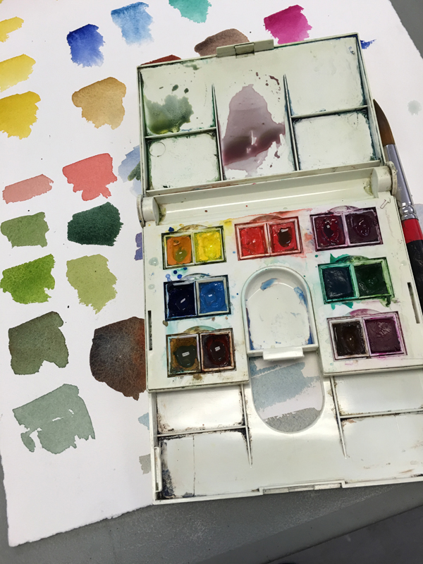
I had ordered a tube of Windsor Newton's New Gamboge before the workshop to replace the tube I had used up and when it came I sent it right back,  It just didn't seem right for my palette.  I feel the Daniel Smith New Gamboge,  is a bit too orange and not the warm yellow I need.  Now I'm on a mission to find a new warm yellow.

A couple of weeks ago I bit the bullet and finally ordered a set of the Daniel Smith Dot Cards, which I have wanted to do for a long time!  Four cards total have a dot of paint of every paint they have in their line.  Just wet with a brush and you have an   actual sample!!!! I wish every manufacturer did this! How great is it to need a color and  know exactly what you are going to get!  I have a few Daniel Smith colors in my palette.  I have purchased quite a few and those I've liked have stayed and I use often and others I use occasionally, but still love them for different purposes.   Now there is no spending money and hoping that I like what I get, at least with Daniel Smith.

So now back to needing to find a new New Gamboge. Comparing the Windsor & Newton New Gamboge, the old formula that I like, to the samples on my Daniel Smith Dot cards, I feel that their Hansa Yellow Deep will be a good substitute! Problem solved.

The cards are $25 plus shipping.  I feel it's money well spent. You get dots of all 238 colors in their line.   It was so much fun to wet them all to see what color was going to emerge,  you could also sense the behavior of the paint, did it move fast or take a while to get the pigment going. I can guess the value range right away for each color, saw some new colors I would like to try, saw some I thought I was interested in but maybe not after getting the dot card, which will save me money in the long run.  And if I'm looking for a new color for a particular painting or want to try something new, I'll be more inclined to look at my dot cards, and perhaps order Daniel Smith. Lastly, they are just so cool to look at!  Really, the only paint manufacturer out there where you can actually truly sample a color without buying a whole tube of paint!

You go Danial Smith! Why didn't I order these sooner?


subscribe to my newsletter
shop original work
shop Giclée prints
shop note cards
In Art Materials, Tips for Artists, Workshops Tags Tips for Artists
2 Comments

Homemade Transfer Paper

March 31, 2016 Kim Minichiello
IMG_5483.jpg

I taught a "Watercolor for Beginners" workshop last week and I thought it might be nice to provide homemade transfer paper for my students to use.  I have heard about the positive virtues of the homemade stuff, especially from fellow WAM (Women Artists Mentors) member, Carrie Waller.  I thought I know what to do, but when things went awry I messaged her on our mentor's group private Facebook page and she set me straight.  Such is the beauty of a mentor group, having instant help and support whenever you need it! I don't always condone the use of transfer paper for every painting.  I paint plein air and from life and draw my image directly on the paper sometime.  When I've taken and composed a photo that already has a good composition and design elements or I have manipulated a photo in Photoshop for design and composition, I use it as a shortcut to get my image on the watercolor paper.  This works great for smaller paintings and can be a bit trickier for larger one.  Essentially you need your image (a photo or drawing) to be the same size as your finished painting to trace over it with the transfer paper in the middle graphite side down between your image and the watercolor paper.  This will be a huge timesaver in the workshop so students can get their image on the watercolor paper quickly and will have more time for painting.

What are the positive virtues of homemade transfer paper as opposed to the one you buy in a role that comes in a box the size of plastic wrap or foil?

It's less waxy and doesn't leave any other unnecessary wax or residue on the watercolor paper.

It's economical!  One homemade sheet can be used over and over again. The other stuff can me used more than once but eventually it gets spent and you have to toss it.

If you work large and need a specific size you can make it any size you want!

A con is it can be a messy process but one I felt was worth it.

So here is how you make it.......

Materials:

  • Tracing Paper
  • 6B graphite stick
  • Jar of powdered graphite (this isn't absolutely necessary but allowed me to cover the paper quicker)
  • Cotton Pads
  • Rubbing Alcohol
  • Old cotton rag or wash cloth
IMG_5488.jpg
IMG_5489.jpg

 Coat your transfer paper as heavy as you can with the graphite stick.  Use elbow grease your arm will get sore but it's good exercise. :-)

IMG_5490.jpg
IMG_5491.jpg

To fill in any gaps use a little of the powdered graphite and with a cotton pad rub it all over the paper.  The goal is to not see any white of the tracing paper.

IMG_5485.jpg

When it's fully covered, take the rubbing alcohol on a cotton pad, not doused just lightly coated a bit more than damp (blot on a paper towel first if you need to) and with light circular motion rub it over the graphite coated side.You will start to see the graphite melt, if you will, into the paper.  Don't rub too hard or you may take all the graphite off.

IMG_5487.jpg

Final step after the alcohol burnish with a dry cotton rag or wash cloth.

That's it! You will notice it rolls itself up into a tight little roll.  When you use it unroll it and place it graphite side down on your watercolor paper and then the printed image or drawing you want to transfer on top and trace with a pencil using a medium to heavy pressure. A regular pencil works best not mechanical pencils. Check that you have the right pressure early so you don't trace the whole image and realize you were too light handed.

Would love for you to leave a comment if you found this helpful!


subscribe to my newsletter
shop original work
she Giclée prints
shop note cards
In Art Materials, Tips for Artists, Workshops Tags Tips for Artists, Watercolor
11 Comments

Where Did January Go and Some New Toys

February 3, 2016 Kim Minichiello
Helen and I at dinner, in Savannah with flat head WAM members, Debra Kierce, Carrie Waller and Maria Bennet Hock.

Helen and I at dinner, in Savannah with flat head WAM members, Debra Kierce, Carrie Waller and Maria Bennet Hock.

Where on earth did January go?  I'm taking some time to slow down a bit!  Aside from the cold I'm fighting right now it has been all good!

I took part in Leslie Satea's, 30 in 30 Painting challenge. Although due to some travel I kind of petered out a bit towards the end.  My goal was to not do 30 paintings but to paint every day on some work I need to finish. Which I was happy to say I did, and made progress on a larger painting.

One weekend was spent in Ocala where I was officially appointed Third Vice President of the Florida Watercolor Society.  Let me just say I'm beyond thrilled to be a part of this fabulous group.  I consider many FWS members as some of my dearest friends and I love the chance to spend time with them in person!  This is going to be about a six year commitment being on the board!  There will be lots to do planning each of the annual conventions from now until 2021! My task this year to to line up all of the demo artists that will be doing demonstrations and presentations at this years convention, as well as work on the social media, mainly the Face Book Page for FWS.

The Evacutaion at the Jepson Center

The Evacutaion at the Jepson Center

The following weekend I headed to Savannah to meet my fellow WAM Member Helen Beacham in person!  After meeting in cyberspace for almost a year and a half now, we got to spend some time together enjoying each other's company.  We spent the day at the Jepson Center to see the Monet and the American Impressionists Exhibition on it's last weekend. Just as we finished the show the fire alarm sounded and we had to evacuate the building!  Many people were swept out before getting a chance to get their coats! It was that same weekend the blizzard had struck Virginia and Savannah was getting the rain and some really cold temperatures from the storm.   I snuck in the coat room and got ours before we bolted out. We found out later it was a sprinkler system malfunction. Lets hope it wasn't in one of the galleries!

IMG_2840.jpg

Of course while in Savannah I got to  spend time with my daughter, who goes to SCAD (The Savannah College of Art and Design)!  She took me to a used art store, where all the SCAD students take supplies and get money for them or shop for supplies at a discount.  Here I am pawing through the watercolor paint bins.  I scored quite a bit for a $1 to $2 a tube!

IMG_5301.jpg
Some New Toys

Some New Toys

I go to life drawing one evening a week and can't tell you how much I feel I have improved.  Figures are not my forté so I feel like if  I can get a few decent drawings from the evening, I'm doing pretty good.  Since art stores abound in Savannah, two Blick stores and the SCAD book store Ex Libres,  I got a few goodies for life drawing as well.

  • Going to try out the Derwent Grahitint Pencels, tinted graphite pencils, which are water soluble.
  • The tin is water soluble graphite that I use like water color and draw the figure with the brush.  This is my second tin of this stuff, I love it!
  • Also trying from top to bottom some Derwent Ink Intense pencils in various colors also water soluble.
  • At the bottom my favorite life drawing tool, the Stabilo Aquarellable Pencil # 8046.

Are you seeing a trend here?  I like to sketch then come in after and get value variations  and washes by melting the pancil lines with a brush and water.

Can't wait to try the new stuff out!  What do you like to sketch with? Feel free to leave a comment!


subscribe to my newsletter
shop original work
shop Giclée prints
shop note cards
In Art Materials, Tips for Artists, Travel Tags Savannah, Tips for Artists, Travel
8 Comments

Into the Woods

November 24, 2015 Kim Minichiello
Into-the-Woods-cprt.jpg
Into the Woods
$35.00

Price Includes Shipping

Limited Edition Archival Giclée Print Signed and Numbered, Edition of 300

Original painting is SOLD.

Image Size:  6” x 6,” (15 cm x 15 cm)


The past few weeks I've working on a couple more small 6 x 6 paintings to add to my mushroom series. I first got the idea to do this series because I love mushrooms, (not the hallucinogenic kind.)  What's so funny as a kid I used to detest them, except for the morels we used to hunt for in the spring. It's funny how your tastes change. I'm fascinated with how they grow, I think they are beautiful to study and look at, and some varieties taste absolutely amazing!  I'm known to pull off the side of the road to snap pictures!  I only wish that I, like all the pharmacists in France, knew which are edible and which are poisonous.  It's a requirement there that they all know this!

I have a dear friend who is from France and she loves mushrooms as much as I do.  I'm attaching a picture of a mother load of porcini's she found once.  She also happens to be a great photographer and she has provided me with some of the photo reference for this series.  "Into the Woods" is based on one of her photos, she took in British Columbia.

My Friend's Porcini Stash!

My Friend's Porcini Stash!

I'm using for this series one of my favorite papers to paint on, Twinrocker.  I love the granulation I get with certain pigments and how they settle into this paper.  They have different surfaces and this happens to be the cold press finish.  When I want a lot of texture, I use the rough paper.


subscribe to my newsletter
shop original work
shop Giclée prints
shop note cards
In Art Materials, Limited Edition Prints..., Watercolor Paintings Tags Floral, Tips for Artists, Watercolor
Comment

Visit to Twinrocker Watercolor Paper Factory

October 31, 2014 Kim Minichiello
Twinrocker-Paper.jpg
Brookston-Water-Tower.jpg

It’s amazing in life how some things come full circle.  I was recently back home again in Indiana, (pun intended), and was so excited to make a trip to Twinrocker Paper in Brookston, Indiana.  Brookston is about a half hour drive from where I grew up, and I passed the turn off to go there every time I made a trip home from Purdue during my college days.  Little did I know that years later I would become a watercolor artist and fall in love with the watercolor paper they make! A couple of years ago my mom and I visited the studio of Terry Armstrong, an Indiana artist who lives in Warsaw.  He told us about Twinrocker, which he uses for his work.   The next day we drove to Brookston, and bought some watercolor paper.  If you buy $100 worth they offer free shipping!  I had never heard of this amazing company until Terry had mentioned it,  and couldn’t believe all these years I was so close and had never been there!  I took a chance that I would like it, invested in $100 worth and had it sent to me here in Florida.

Sales Room at Twinrocker Paper

Sales Room at Twinrocker Paper

Once I started using it was I ever glad I took the chance.  I have experimented with it and used it the last couple of years and if I prefer a certain look for a painting, I use Twinrocker. My painting Mayan Gate was done on the Twinrocker cold press and has been juried into four shows, two of them were International Exhibitions.

Mayan Gate Watercolor on Twinrocker Paper, Cold Press

Mayan Gate Watercolor on Twinrocker Paper, Cold Press

Since Kathryn and Howard Clark founded Twinrocker in 1971 they have been making handmade paper in the European tradition, for stationary, book arts and watercolor.  Kathryn has sinceretired, and nowTravis Becker isthe current owner and master paper maker. He started working with the Clarks when he was 19. I highly encourage you to visit their web site to read the fascinating history behind how the Clarks started making paper.

Travis Becker, Owner Twinrocker Paper & Master Papermaker

Travis Becker, Owner Twinrocker Paper & Master Papermaker

On my visit I met with Travis and he showed me around a bit.  This is a small facility with 4 employees:  Gail is the Office Manager, Fran, Customer Service,  Travis, Owner & Master Papermaker, and Gerald, Papermaker.   Travis and Gerald make all the paper molded and finished, entirely by hand using pre consumer waste cotton from United States manufacturers.

Gerald molding envelopes.

Gerald molding envelopes.

Vat of Pulp

Vat of Pulp

The day I was there Gerald was molding envelopes and Travis was going through a stack of watercolor paper about 6 inches high that had been molded and  run through the press.  Each sheet was layered between felt and after its run through the press it is removed from the felt, inspected for imperfections and stacked to dry before it can be gelatin sized.

Travis inspecting each sheet and removing any imperfections.

Travis inspecting each sheet and removing any imperfections.

Each watercolor sheet is then gelatin sized by hand. Once they have a large quaintly of paper made they will spend a day or two doing nothing but sizing.   The sheet goes through the sizing, maintained at a constant temperature, one at a time, and then Gerald and Travis rub each sheet, both sides, by hand, to smooth out the sizing and remove air bubbles. This is critical if there are any air pockets where the sizing isn’t adhered to thepaper it will show once paint is put to paper.  I was in awe of this whole process.  I am so appreciative that there are still craftsman like Travis and Gerald that are producing a product like this that is more than special.

Twinrocker Press

Twinrocker Press

Every time I start a painting on Twinrocker I feel a reverence toward it before I put brush to paper.  I feel even more so now after visiting and seeing how much care and attention is put into each sheet.  What boggles my mind in addition to the process and care of production, is the science that goes into creating the different weights and surface textures.  They offer hot press, cold press, and rough surfaces, and different weights or more accurately for them thicknesses.  Since the paper is handmade it can vary slightly in thickness from sheet to sheet.  Therefore they don't describe their paper in weight like the other watercolor paper companies, but by the thickness per sheet measured by a micro meter, to arrive at a thousands of an inch thickness and is assigned a letter code.  All of this is described on their web site.  HA which stands for heavy art weight (HA) is roughly a 250lb./460g/m2 paper.

Pulp Prep Room

Pulp Prep Room

Twinrocker has been available by two major retailers, but Travis told me starting next year they will only be selling paper through their web site. The reason being,  It hasn’t been fair to Twinrocker to give the retailers a big discount, they have done little or no marketing or promotion for them, in exchange for the discount,  and then sell the paper cheaper per sheet than what Twinrocker sells it for directly from their site, essentially undercutting Twinrocker on price.

Because it is handmade, it is more expensive than some papers.  It retails at $14 per sheet.  This is only $2 more retail  than a sheet of 300 lb Arches, which I use as well, but in my opinion is so worth it.  If you paint in watercolor, I encourage you to try this paper!  It has been mostly by word of mouth that this watercolor paper has endured in the market place since 1971.  Not only will you be painting on one of the most beautiful papers made today, you will be supporting, a small independent company, with just 4 employees, two of them master craftsmen that are carrying on a tradition that could become a lost art if they weren't doing it.  And to top it all off, it’s entirely made in the USA!  No other watercolor paper on the market today has that distinction!

Paris Passy Gate, Watercolor on Twinrocker Rough

Paris Passy Gate, Watercolor on Twinrocker Rough

I want to thank Travis for taking the time to show me around and it’s my privilege to spread the word about Twinrocker. This is some what self serving,  I love this paper so much I want them to be successful and keep making it!

Gate-of-Reverence-coprt1.jpg

Gate of Reverence, Watercolor on Twinrocker Cold Press

A Side Note:  Recently at the Florida Watercolor society convention, I came acrossa new paper on the market, Fluid 100 which claims to be made in the USA.  However, I was told by the representative at the show selling the paper, that it is actually made in Europe but finished in the USA.  Because the last step of production is in the United Sates, they can put made in the USA on the product.  However, it’s not entirely true.


subscribe to my newsletter
shop original work
shop giclée prints
shop note cards
In Art Materials, Interviews, Tips for Artists, Watercolor Paintings Tags Tips for Artists, Watercolor, twinrocker
6 Comments
← Newer Posts

Copyright Kim Minichiello 2021