• Bio
    • Awards
    • Exhibitions
    • Press
  • Contact
    • Studio & Plein Air Paintings
    • Collections
    • Walt Disney World Projects
  • Videos for Purchase
    • Workshop Videos for Purchase
    • Interviews
    • What People Are Saying...
    • Workshop Video Downloads
  • Events
  • Blog
Menu

Kim Minichiello

Street Address
City, State, Zip
407-668-7082
Artist ⦁ Designer ⦁ Traveler ⦁ Mentor

Your Custom Text Here

Kim Minichiello

  • About
    • Bio
    • Awards
    • Exhibitions
    • Press
  • Contact
  • Artwork
    • Studio & Plein Air Paintings
    • Collections
    • Walt Disney World Projects
  • Videos for Purchase
  • Videos
    • Workshop Videos for Purchase
    • Interviews
  • Workshops
    • What People Are Saying...
    • Workshop Video Downloads
  • Events
  • Blog

"Gate of Reverence" More Work in Progress

June 6, 2014 Kim Minichiello
WIP-Gate-of-Reverence-9.jpg

After Clowning Around, (no pun intended), my latest painting, I'm back to working on Gate of Reverence.  I'm in the detail and value phase now.  Since my last post, I have added more detail to the central figure.  I've also tweaked the dark background on the sides just a bit.  I thought the darks were too uniform so I went in with some pure water washes to do some lifting of pigment at the same time adding some washes of color to bring out a green tone in the dark background to tie in with the gate.

Next I will be adding more detail.  This is depicting a stained glass window in the background, so I will be painting in the lead lines, maybe adjusting value a bit more and working on some hard and soft edges.  This one has been a challenge for me, because I'm painting a bit tighter than I normally paint,  but still painting representational and trying to  avoid a photo realistic interpretation.  Hopefully I'm achieving this goal!


subscribe to my newsletter
shop original work
shop giclée prints
shop note cards
In France, Paris, Tips for Artists, Travel, Watercolor Paintings Tags France, Paris, Tips for Artists, Travel, Watercolor, Work in Progress, gate of reverence more work in progress, “Gate of Reverence” More work in progress
Comment

New Work...Clowning Around

June 2, 2014 Kim Minichiello
Clowining-Around-coprt.jpg

I took a little break from Gate of Reverence to work on this small painting. I had done a ton of research, taking photos at the Nemo & Friends Pavilion at Epcot,  to paint the Coral Reef Restaurant Menus and have wanted to do more sea life themed paintings.  This months themed exhibition at the 127 SoBo Gallery in Winter Garden, Florida is She Sells Sea Shells:  Works focusing on nautical themes and water.  Perfect!

This is another painting like Star Struck that I mounted to a cradled board and sealed with a spray acrylic sealer, thus, no need for framing with glass.  I like the idea of doing a series of these sea life themed paintings mounted this way.  I feel it would make a great collection to hang together, or to set on shelves or table tops!

If you are an artist interested in this process of framing without glass. I am in the process of writing an article on the steps and techniques, which will be available for download. I would like to experiment with a few more sealing options before publishing the article so please stay tuned.

If you are interested in purchasing this painting please contact me.  It will be at the 127 SoBo Gallery the months of June and July and if purchased then, 30% of the sales will go to the gallery, which is a non profit organization!

Hope everyone is having a great start to the summer!


subscribe to my newsletter
shop original work
shop giclée prints
shop note cards
In Disney, Exhibitions, Tips for Artists, Watercolor Paintings Tags Exhibition, Tips for Artists, Walt Disney World, Watercolor, new work…clowning around
9 Comments

New Work Paris Passy Gate

April 23, 2014 Kim Minichiello
Paris-Passy-Gate-coprt.jpg
Paris Passy Gate
$2,500.00

Watercolor on Archival Handmade Paper, Framed

22" x 19," (56 cm x 48 cm)

Framed Size 30.35" x 27.5," price includes frame

Accepted into the 2015 Pennsylvania International Exhibition at The Carlisle Arts Learning Center

Inspired by the Passy area where I lived in Paris. For more information please visit my blog by clicking here.

Email me for purchase information.

I’m happy to post that Paris Passy Gate, c’est fini!  If you have been following my blog or Facebook pages I have been documenting the work in progress on this painting.  The last post I had all the block in completed and needed to analyze the painting for value and add details.  I hope you can see what a difference value makes!  There is a saying among artists and no one I’ve talked to seems to know the origination of the quote.  “Color gets all the credit, but value does all the work.”  This is so true.  You can paint something in a completely different color scheme than what the original subject is, and it will work if the values are correct.

My goal for this painting was to experiment with getting a lot of texture from the pigments and work with a grayed palette.  I’m very happy with the outcome.  I’m always nostalgic for Paris especially in the spring time, and wanted to capture a place in the area where I lived which is also down the street from the apartment of a very dear friend I met while living there.  When we met she was 90 years old but seemed like she was in her 70’s.  We met by chance in a cafe and she started speaking with me in English because she had been married to an American man whom she met in Paris on V-day after WW II.  From the day we met we got together almost every week for lunch and we are still friends and speak on the phone often.  I thought of our special friendship a lot while working on this painting.


subscribe to my newsletter
shop original work
shop giclée prints
shop note cards
In France, Paris, Tips for Artists, Travel, Watercolor Paintings Tags France, Paris, Travel, Watercolor, paris passy gate, new work paris passy gate
4 Comments

Star Struck is Framed Without Glass

April 1, 2014 Kim Minichiello
Star-Struck-coprt.jpg
Star Struck
$500.00

Watercolor 

Mounted on Archival Board with 2" Wood Edge

12" x 12" x 2,"  (30.5 cm x 30.5 cm x 5cm)

Accepted into the 2015 Women Painters of the Southeast Annual Exhibition at the Blue Ridge Arts Association, Blue Ridge, Georgia

Inspired by the light and cast shadows on a bromeliad. 

Email me for purchase information.


Last year while I was attending the annual exhibition of the Women Painters of the Southeast.  I visited a gallery where there was a watercolor artist who had mounted her paintings on board and sealed them.  Therefore, there was no glass, mat board or frame.  They were displayed just as an oil would be, painted on a gallery canvas.  I mentioned to the gallery owner how intrigued I was by this since I also painted in watercolor.  She mentioned that many collectors and galleries don’t value or maybe I should say don’t think there is as much value in works behind glass, and many galleries decline works that are. This piece of news was a bit shocking to me.  Really?  One more struggle to overcome for watercolor artists!

I don’t agree with this philosophy so I won’t be mounting all my paintings from now on, but I was still intriguedand wanted to try it.  After doing some research I came across a video done by artist Birgit O’Connor.  My new work Star Struck I thought would be the perfect candidate to give this process a try.  Essentially, it involves mounting your painting to an Ampersand Clay Board, with a soft gel medium and sealing with and archival varnish with ultra violet light protection.

Star-Struch-front-coprt.jpg

I like that you can hang on the wall or place on a table or shelf.

I was pleased with the results.   I would like to experiment a bit more as to the final finish on the surface of the painting.  The Golden Archival UVL Sealer comes in gloss, satin and matte.  I am am also curious about the Renaissance wax that Julie Ford Oliver has recently tried, thinking that would give a nice sheen to the surface as well.

Star-Struck-side-coprt.jpg

As I experiment a bit more I will be sharing the results, going into a bit more detail on the processes that have worked for me. Any artists materials I use,  I am very conscientious  of the archival factor.  I have been assured by all the specifications that  the materials I use for my paintings,  paper, paints, mat boards, etc., are archival.  The materials used for this process, board, soft gel medium and spray sealers also claim to be such.  I know there are a few out there that won’t feel this is adequate protection for a watercolor painting.  But, only time will tell!   At least with the sealer you are also getting UVL protection.

 This painting will be available at the

Winter Garden Art Association's

April Exhibition, 127 SoBo (South Boyd), Winter Garden, Florida.


subscribe to my newsletter
shop original work
shop giclée prints
shop note cards
In Flowers, Tips for Artists, Watercolor Paintings, Women Painters of the ... Tags Floral, Tips for Artists, Watercolor, Women Painters of the Southeast
5 Comments

More Work in Progress of Paris Passy Gate

March 4, 2014 Kim Minichiello
Work in Progress of Paris Passy Gate

Work in Progress of Paris Passy Gate

Today I’m sharing some more work in progress photos of one of my latest paintings Paris Passy Gate.  The focal point of this piece will be the gate itself which I decided to mask out so I could just do the background and not have to worry about painting around everything.

Paris-Passy-Gate-Second.jpg

I’m working on a softer paper which I can work in more textural techniques, but have to be very careful.  This paper is not for those who like to glaze multiple layers.  The paint moves around very easily if it is re-wet.  It’s great for softening edges but it’s more of a get in and get it done process while working on it.

Paris-Passy-Gate-third.jpg

Since I was  going to be working on the Coral Reef Menu project for a while I wanted to get the background finished so I could remove the masking.  I didn’t want the masking sitting on the paper very long and take the chance of it ruining it or not coming off! It’s happened before. :-(

Painting-Paris-Passy-Gate.jpg

subscribe to my newsletter
shop original work
shop giclée prints
shop note cards
In France, Paris, Tips for Artists, Watercolor Paintings Tags France, Paris, Tips for Artists, Watercolor
2 Comments

Accepted into the 35th National Georgia Watercolor Society Exhibition

February 5, 2014 Kim Minichiello
Waiting-in-the-Wings-cpyrt.jpg

I’m thrilled, my painting Waiting in the Wings was chosen for the 35th National Georgia Watercolor Society’s Exhibition!  This is my second year in the show.  Last year my painting Hong Kong Happy Hour was chosen.  It’s always a great honor for me to be juried into shows, and to have my work included with some of the most talented watercolorists in the nation for national shows and from all over the world for international shows.

If you enter a few shows a year whichI do, the logistics of keeping track of it all can be tricky!  Some show dates conflict with each other.   Therefore a careful review of your inventory is necessary to decide which paintings will be submitted where.  Some will accept three paintings for the judge to see, some accept two, and some only accept one.  But usually only one paintingis juried into the show.  Many shows are going on at the same time, therefore if you submit three paintings for one judge to review for a particular show, those can not be submitted for other shows because any one of the three could be chosen and you don’t know which one it will be!

You always want to submit your best work, but usually out of the two or three you submit, you have a personal favorite that you feel is the strongest.  But, your favorite may not be the favorite of the judge, and he or she will choose their preference!  Judges are different from show to show.  Therefore, if a piece is rejected one year, from one organization, doesn’t mean it will be another time from a different judge!

If you are interested in submitting work to juried shows, keep your brushes moving so that you have a good inventory to choose from.  Only submit you strongest work that you are most proud of.  Keep careful records so that you don’t submit the same painting that may be tied up in another show, sold, or not be shipped back to you in time for the other deadline.  Most of all don’t give up!!! Rejection is all part of the process which doesn’t mean you are a bad painter or your work is bad either.  The way I look at rejection from shows is, the judge’s taste just didn’t lean toward my work, and now I have a painting that is available as consideration for another show, where the judge’s taste might lean in my direction!


subscribe to my newsletter
shop original work
shop giclée print
shop note cards
In Asian, Exhibitions, Hong Kong, Tips for Artists, Watercolor Paintings Tags Asian, China, Exhibition, Hong Kong, Travel, Watercolor
Comment

Work in Progress of Odd Man Out

December 13, 2013 Kim Minichiello
Watercolor on Handmade Paper

Original Plein Air Watercolor  Sketch, Peel Street Hong Kong

Today I thought I would share some work in progress photos of my painting Odd Man Out.  I developed this large painting from a watercolor sketch I did plein air on Peel Street in Hong Kong, and photos that I took the day I did the sketch.  I took the photo after I did the watercolor sketch and the lighting had changed dramatically. Thehotnoon-day sun was shining through the lanterns onto the sign for the shop, popping the color and making the lanterns glow, as well as creating some interesting lighting on the sign.

1_Progress-Odd-Man-Out.jpg

In the larger painting, 40” x 20.5,”  I wanted to capture the light hitting the lanterns making them glow.  I wanted to represent the washed out feeling of the sign behind, with the bright sunlight shining on it, which made the lanterns stand out more.   All of this was juxtaposed against the cool gray concrete textural facade of the actual building, creating a play of warm against cool.  Most all facades in the market streets of Hong Kong have the ubiquitous wires, tarps, pipes, grunge, and a variety of elements kluged together, for displays,  to hold up awnings and signs, etc.  I wanted to include some of those elements in the painting as well.

2_Progress-Odd-Man-Out.jpg

The sketch shows two lanterns with faces. But, I had the idea for the title of the painting, Odd Man Out,  which made sense to use only one “face lantern.”  Then after painting the Chinese Goddess figure, in the lowest purple lantern in the composition, I thought it would be fun to have the lantern with the face gazing down at her.  Also, putting it where it had been in the sketch would have been too much contrast, and would have called too much attention to the very bottom of the painting.  I  also took some liberties with the placement and colors of the lanterns to make the composition more interesting.  I don't work directly from the photograph but use it as a guide.  Photos don't always present us with the best design for a painting.  Plus, a major enjoyment for me while I paint is to recall the place and the memories of being there.  If I'm so focused on a photograph, I tend to miss that opportunity.

3_Progress-Odd-Man-Out.jpg

The completed painting on the easel gives you an idea of the scale.  I really enjoy working larger in watercolor!

4_Final-Odd-Man-Out.jpg
Odd-Man-Out-copyrt.jpg

subscribe to my newsletter
shop original work
shop giclée prints
shop note cards

20% of all sales this month go toward the relief effort for Typhoon Haiyan in the Philippines.

In Asian, Hong Kong, Tips for Artists, Watercolor Paintings, Watercolor Sketch Tags Asian, Hong Kong, Plein Air, Travel, Watercolor, Watercolor Sketch, workinprogressofoddmanout
Comment

The Florida Watercolor Society Convention in Sarasota

September 23, 2013 Kim Minichiello
My friend, Frank Spino with his Painting, Orange Crush, Frank is also the cover artist of Splash 14

My friend, Frank Spino with his Painting, Orange Crush, Frank is also the cover artist of Splash 14

What and amazing weekend!! I am so honored and proud to be a member of the Florida Watercolor Society!  It is 970 members strong and there was an attendance this weekend at the conference of over 500.  It is the only watercolor society in the nation that makes an event and conference around the annual exhibition. Here is a brief run down of how it all progresses.   The week before the show,  there are 2 four day workshops given by a variety of well known artist.  One of the workshops is always given by the judge of the show.  Last year workshops were given by Nicolas Simmons and Soon Y Warren.  I was thrilled Nick chose my piece to be in the exhibition, and his workshop was amazing.  This year’s workshops were given by Linda Baker, the judge of the show, and Mike Bailey, former president of the National Watercolor Society.  This year a third one day workshop with Sue Allen was offered too.  These workshops are optional, very popular and they usually fill up very fast.

My friend Jorge Leon & Moi, next to his painting, Waiting for You, Congrats to Jorge who got his FWS Signaure Status this show.

My friend Jorge Leon & Moi, next to his painting, Waiting for You, Congrats to Jorge who got his FWS Signaure Status this show.

On Thursday evening, after the workshops conclude the judge of the show gives a keynote talk and demo.  Linda Baker’s demo was wonderful.  She is such a sweet person and I was intrigued to learn more about her painting technique which involves more masking and pouring.  Then Friday the fun continues.... a full day of demonstrations given by a wide variety of artists in the conference rooms as well as the trade show.  There is so much to do and see, you can’t possibly do it all.  It’s hard to pick and choose!  This year I attended demo’s given by, a roster of amazing Florida artists which includes:  Janet and Steve Rogers, Pat Weaver, Karen Braverman, Lynn Ferris, Sterling Edwards, Teresa Kirk, and Jamie Cordero.  Mike Bailey also did a demo on Saturday.  There are also expert panels, and talks on marketing and showing your art, and digital critiques, given by painters who are very well known in our field, who have painted, taught and judged shows for many years.

Janet Rogers giving demo at Cheap Joe's Booth

Janet Rogers giving demo at Cheap Joe's Booth

Did I mention trade show?  A whose who of the art supply world is there, Cheap Joe's, Jerry’s Artorama, giclee companies, local art supply companies, and representatives from all the regional watercolor societies.  All giving great deals and discounts so that we can stock up for the year!  The president of Daniel Smith also attended the conference.  I was thrilled to meet and get to know Joe Miller, Cheap Joe.  He is the kindest and sweetest person that does so much for us artists.

Mike Bailey starting his painting in the Paint Around

Mike Bailey starting his painting in the Paint Around

Saturday bright and early I volunteered to help with the Paint Around. Five artists prepare a drawing and reference material, each start with their painting but every 10 minutes, the paintings swap easels!  Every artist works on each other’s paintings.  You end up with your own at the end to finish it.  You never know what’s going to come back to you!  All the paintings are raffled off with many of other raffle items and prizes that take place throughout the weekend and raise money for FWS.

Lynn Ferris Demo

Lynn Ferris Demo

Saturday is similar to Friday, more demos, trade show, plus a digital critique given by the judge, who goes through every painting accepted into the show, explaining why they chose it and what they liked about it.  I also had a chance, for a fee,  to do a half hour critique, one on one, with this year’s judge, Linda Baker.  I did not get into the show this year, and it was a great opportunity to really know why and put the speculation to rest. I could submit 10 of my paintings for her to review.   My take away from the meeting was basically it was the subject matter I chose to enter this year.  Looking at my portfolio there were three paintings she would have chosen had I entered those! You can never second guess what a judge is going to be drawn to.   She also gave suggestions for some small improvements that would make some paintings more appealing to a judge.

Friend Teresa Kirk with her painting, Scorpion VII, this painting also won an award in the show.

Friend Teresa Kirk with her painting, Scorpion VII, this painting also won an award in the show.

On Saturday, I had the opportunity to have a 10 minute meeting with the editor of Splash, Rachel Rubin Wolf.  She looked at 2 of the paintings Linda did, and I found it curious that there were elements in the paintings that she questioned that Linda liked and vice versa!  It just goes to show that there is no right or wrong, what one may be drawn to another might not.  Don’t be discouraged to enter shows and competitions.  The judges vary with each and eventually one will click with your work!  The main take away  from a number of judges I have heard talk on the subject of jurying shows and what they are looking foris,  design and composition, emotion, emotion, emotion!, hand of the artist,  creativity, and lastly technique.

Karen Braverman Demo

Karen Braverman Demo

The weekend concluded on Sunday with the general meeting and a presentation by Rachel on her role as editor of Splash, her process and what she is looking for as she chooses artwork for publication.  The same rules apply as getting juried into shows, but differ too in that she is putting a book together and is focusing on what looks good on a page, versus an exhibition.  And of course, her own tastes and preferences factor into the final selections.  When it comes down to choosing between two outstanding images, it can be like splitting hairs!

One of the best parts for me of the whole weekend is seeing friends, making new friends, and being with hundreds of people that have the same passion you do!   Now, it’s time to get busy and paint!!!!!


subscribe to my newsletter
shop original work
shop giclée prints
shop note cards
In Demo, Exhibitions, Tips for Artists Tags Exhibition, Florida Watercolor Society, Tips for Artists, the florida watercolor society convention in sarasota
5 Comments

Shipping Large Paintings: What I've Learned

August 26, 2013 Kim Minichiello
Air-Float-Photo.jpg

In the next couple of weeks I will be shipping five paintings to two different shows so I have packing and shipping on my mind.  This week I thought I would share another shipping story.

It seems like when you need to ship artwork once you have done it a few times you think to yourself okay, I got this.  I’m finally figuring this whole thing out.  See my previous posts on shipping FedEx vs. UPS and Declared Value:  What does this mean?

After my last shipment of a large painting I have another dilemma that I’m going to try and solve before my next shipment of a painting this size.  This particular experience is with UPS and shipping large artwork.   I’m not sure what the guidelines are for FedEx.  If anyone knows please feel free to make a comment with this post.

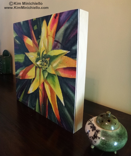
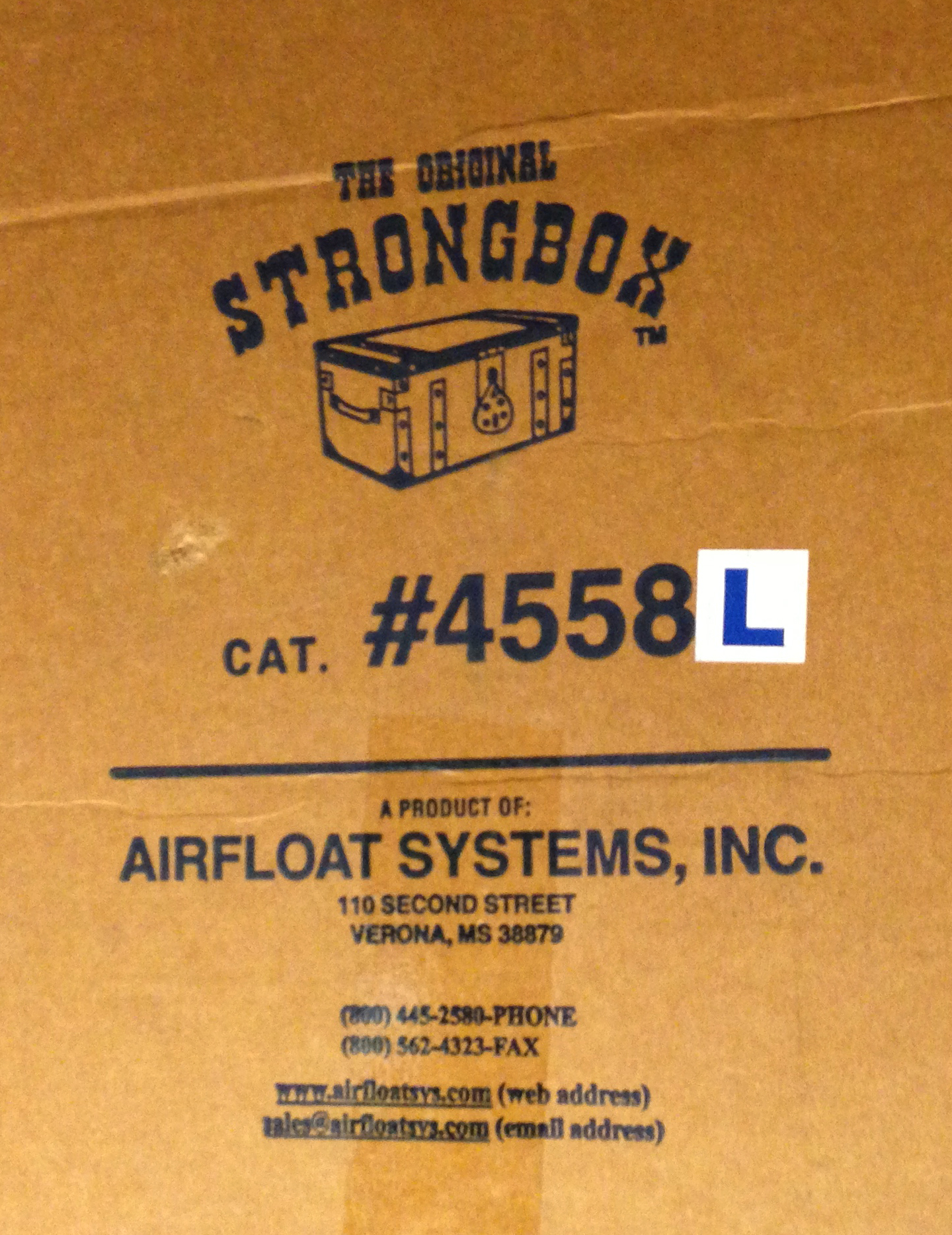
Last spring, I needed to ship a painting on a full size watercolor sheet, 22” x 30”  after it was framed the total dimension ended up being.  35” x 43”.  From my experience with the Florida Watercolor Society show, helping to unpack and pack paintings when the show was over, I discovered most, but not all, artists used the AirfloatSystems box. It’s used for ease in packing, and durability and the fact that it can be used multiple times.  After a lot of research I decided to get an Airfloat box for this painting and ordered one that was thick enough to pack the two paintings that I needed to send to a show.  I had seen another artist ship two paintings in the same Airfloat box and figured it would be okay.  The box was a few inches bigger around than the largest painting to protect it.  I used an extra layer of foam between the 2 paintings, with the larger painting on the bottom.  Each painting also had the foam pieces on each side, that went from the edges of the frames to the box's outer edge.

I ordered an Airfloat box measuring 45” x 48” x 5.5”.  However, before I ordered the box,  I called UPS to make sure that this did not fall within the oversize box category because these Air Float boxes are not cheap even with the 20% discount I got from being a member of the Florida Watercolor Society.  I figured since I could re-use the box it would be an investment when I need to ship large paintings.  This dimension fell with in the guidelines for NOT being oversized, which if it was, would result in up charges from the already expensive shipping cost!

Here is where this gets interesting.  The UPS formula for calculating whether a box is oversized is Length + Girth = not to exceed 130.”  Girth is 2 times the width of the box plus 2 times the height of the box.  As long as this figure added to the length doesn’t exceed 130” you are safe.  If this figure is 131” to 164” then you will be charged a $55 up charge and if it exceeds 165”  then there are more charges beyond that.  This is what a UPS representative told me over the phone.

You can imagine my surprise when I got my invoice from UPS and they had audited the size of my box and charged me extra for it being oversized!!  Trying not to let the steam escape from my ears, I called UPS andreiterated the whole process of calling them before I made this big investment, buying this Airfloat box with plans to re-use it, but didn’t feel confident doing so if I was going to be charged every time for it being oversized.  She told me they had measured the box at 46” x 60” x 7”  on the way to the gallery,  and if you apply the formula, Length + Girth = 134,” it’s four inches over the 130” maximum!

I told her that was not the dimension of the box I sent.  I had measured it myself when I packed it and it was what Airfloat had stated it was when I ordered it, 45” x 48” 5.5.”

When my second invoice came after the box had been shipped back to me from the gallery, same thing, an up charge for an oversized box. You have got to be kidding!  After I got the box back I measured it to clear this up once and for all, and to my surprise again, UPS was right!  The box was 46” x 60” x 7,” it had grown!  It literally stretched with the packing and movement of shipping.  It was no longer the acceptable dimensions I was counting on when I ordered it to begin with.  The extra layer of foam to ship two paintings may have had something to do with the increased depth, but the sides also expanded as well.

The moral of this story is, if you ship large artwork with UPS, be aware of this formula or you will be slapped with up charges!  Also if you order from Airfloat, don’t count on the actual dimensions they have on their catalogue.  The box may grow after it is used just one time!

This story did have somewhat of a happy ending.  Even though my box was bigger, UPS waived the up charges for me this time.  However, now I have an expensive Airfloat box I can’t use again unless I’m willing to pay more than $100 dollars more in up charges in addition to the charge to ship the box to it’s destination and back.  Maybe I can make it into a work bench or lay out table.  Any other ideas?


subscribe to my newsletter
shop original work
shop giclée prints
shop note cards
In Tips for Artists Tags Shipping Artwork, Tips for Artists, shippinglargepaintingswhativelearned
2 Comments

Watercolor Sketching Equipment

June 26, 2013 Kim Minichiello
Materials.jpg
Materials-detail.jpg

You can do watercolor sketches just about anywhere.   I highly encourage you to try it in your home or studio and consider it “play!”  This is where you can just play with the materials, discover what pigments you like best, what paper you prefer, what brush do you gravitate to the most.  Force yourself to use a bigger brush than you are used to, maybe a natural hair brush, versus a synthetic hair brush.  Which feels best for you?  If you are an experienced painter in watercolor, force yourself to use a different paper than you are used to, or different brushes.  Keep this in mind, don’t labor over it... it’s a sketch!

Most watercolor sketching I do is on location or plein air.  If you would like to work on the figure, try sketching in a cafe or coffee shop.  If you enjoy florals, go to a favorite park or your garden.  If you would like to paint plein air, you can do landscapes or urban scenes.

My favorite time to watercolor sketch is when I’m traveling.  My watercolor travel journals are a treasure to me.  I look at them often just to remember the places I’ve been, recalling smells, sounds or interesting things that happen while I’m sketching or people I meet and talk to.  It all comes back.   I also use them to develop larger paintings.

Today I thought I would share with you my equipment.  When I go out on location I want to keep it as light as possible and I’ve have narrowed it down to these essentials:

  • Watercolor sketch book- I use one with hand made paper from Nepal or India.  I love the deckled edge, texture of the paper, and it doesn’t take to being too wet or being overworked, so I stay in that “sketch mode.”
  • 2 brushes-  a #18 round, and a #16 flat
  •  My Windsor & Newton, compact paint palette- Here is a handy tip.  When I run out of paint in the little pans.  I just squeeze more in from my tubes and leave it out to air dry and get hard.
  • A collapsable water container
  • A bottle of water- I recycle a water bottle.  I always take water with me because I can never count on water being at the location I want to paint.
  • A travel pack of tissues or a few paper towels.
  • Mechanical pencil and a pack of leads.
  • 2 permanent ink pens
  • A kneadable eraser
  • A binder clip to hold my page down, if it’s windy
  • My black canvas pouch to keep all the above in.  I also use a bamboo brush holder for my brushes.
  • A stool- I have 2 a simple triangular one that folds up and fits in a case and nifty one that combines a stool and backpack.  I found this in a sporting goods store in Paris in the fishing section!  I love it for sketching in museums, too.  I sit on it with the backpack section in the front and have easy access to all my materials.
Stools.jpg

All the sketches I have posted and will continue to share were all done with just these items!  I feel the brushes are key.  As long as you have one good big round brush that comes to a nice point, that is all you need.  It will also hold more water and allow you to be more gestural and spontaneous with your painting.  Have fun!  :-)

A funny story... Like I suggested try and keep your kit as light as possible.  I have been known to carry my stuff around with me all day while we are touring around, and never get around to doing a sketch.  My daughter teases me and asks me if I did, “performance art,” or  “real art”   that day!  She happens to be an actor and performing artist and sometimes a smarty pants.


subscribe to my newsletter
shop original work
shop giclée prints
shop note cards
In Plein Air, Sketches, Tips for Artists, Watercolor Sketch Tags Plein Air, Tips for Artists, Watercolor, Watercolor Sketch, watercolorsketchingequipment
2 Comments
← Newer Posts Older Posts →

Copyright Kim Minichiello 2021